Display Best Practices
Displaying Comparative Quality and Cost Measurements: Key Considerations to Engage Consumers in their Health Care Decisions
Much of what is displayed in the public reports of the Alliances continues to change and evolve as new measures are developed and new approaches are tested. Quality comparisons used by the Alliances include a range of measures and display formats, yet the key lessons learned across the Alliances are the same.
Exhibit 3. Example of a Clear Public Reporting Home Page
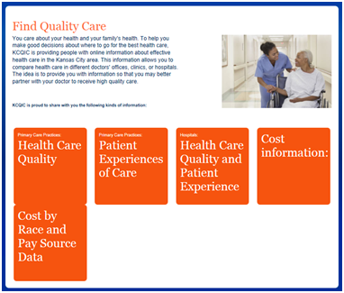
1. Make the purpose clear on the home page (see Exhibit 3[LT1] ). Public reporting sites must first help consumers understand the context and purpose of quality ratings. The home page should highlight the importance of making informed decisions, and how comparative performance information can be used to help consumers choose providers. For additional information on effective home pages, see “Improving Public Reporting Websites for Consumers: Lessons learned from consumer testing of Aligning Forces for Quality websites.”
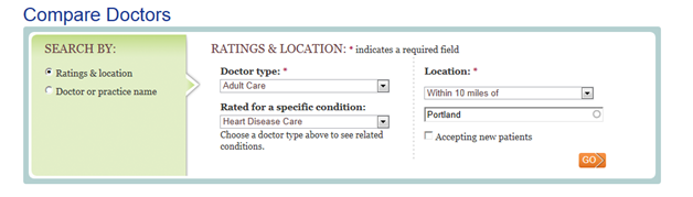
2. Allow users to select the measure(s) and providers to compare. Alliances found that allowing users to choose the providers and measures that they wanted to compare reduced the cognitive load and increased the relevancy of the information. When displaying results, make sure users have clear instructions on how they can change their search to allow them to quickly find information that reflects their needs and preferences (e.g., specific condition, location). See Exhibit 4[LT2] for an example from the Maine Health Management Coalition.
Exhibit 4. Example of a Consumer-friendly Search Feature
3. Use a consistent framework for all comparisons. The purpose of displaying comparative quality data is to help users apply the data to their health care decisions. A framework that is introduced on the home page and integrated throughout the entire website will clearly organize information so it is easier for participants to understand and use. The framework should also communicate the importance and relevance of the information to consumers. This can be done by using the Institute of Medicine’s six domains of quality—safe, effective, patient-centered, timely, efficient, and equitable—to group measures in the display. Patients find effectiveness, safety, and patient-centeredness to be most meaningful.[1] The Maine Health Management Coalition has adopted this approach, called a quality framework, in its public reports of ambulatory and hospital care (www.getbettermaine.org) by organizing the information into three categories: safe, effective, and patient experience (see Exhibit 5. Example of a Quality Framework).
Exhibit 5. Example of a Quality Framework

4. Make it easy for consumers to identify patterns. Comparisons should be understood visually and require minimal reading. The use of word icons or symbols, displayed in a consistent pattern, helps users to see high and low performers side by side with minimal processing, thereby reducing consumer burden. Word icons helped visitors recognize patterns such as identifying top and low performers within and across measures. See Exhibit 6 for an example of a public report from the Washington Health Alliance that uses word icons to help consumers identify patterns. Another way to reduce consumer burden is to allow users to “drill down” to see additional information, for example the scores for individual measures in a summary score.
Exhibit 6. Use Word Icons to Show Patterns

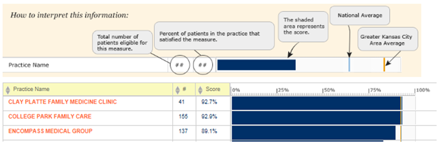
5. Employ clear labelling and explanation. Use plain language techniques to provide simple and clear labels and definitions of the measures to help consumers understand the information. Additionally, clear explanations of the scores need to be displayed in the comparisons to help users understand the numbers or performance categories, particularly word icons such as “better” and “average.” This helps users interpret the displays accurately. See Exhibit 7 for an example of clear explanations of the measures and scores.
Exhibit 7. Example of Clear Explanations of Measures and Scores
[1] Hibbard, J.H., Greene, J., and Daniel, D. (2010). What Is Quality Anyway? Performance Reports That Clearly Communicate to Consumers the Meaning of Quality Care. Medical Care Research and Review, 67(3): 275-293.